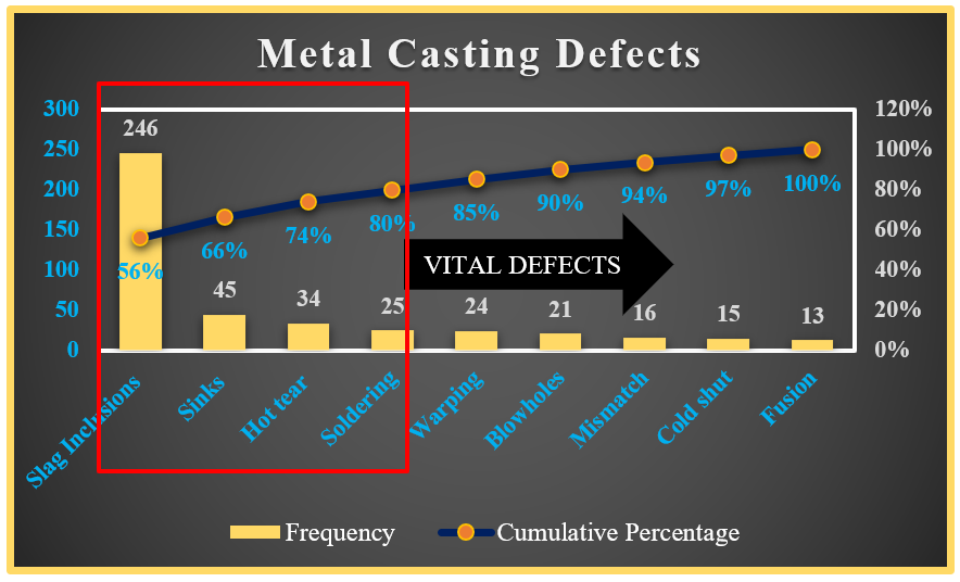
The Pareto Chart is based on the 80/20 rule.
80% of the effects for a given cause come from approximately 20% of the possible causes.
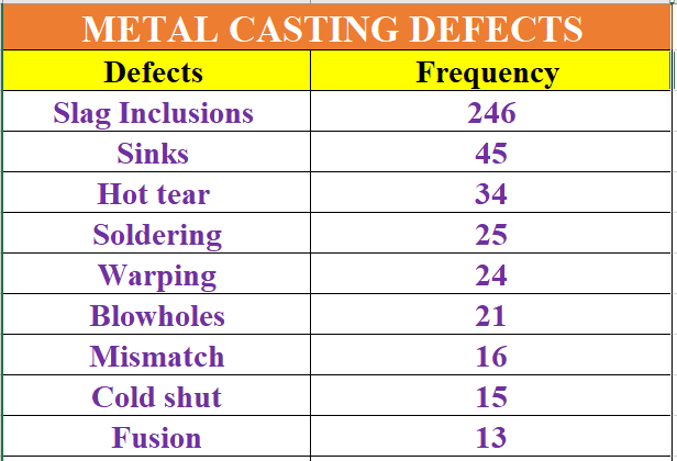
For example, we have the metal casting defects with its frequency and we want to create a Pareto Chart.
This can be done by following the simple steps as mentioned below:
1. Sort the data by frequency column from Largest to Smallest.
2. Find Cumulative Frequency.
3. Find the Percentage Cumulative
4. Select the data and insert a 2D column chart
5. Double click on the horizontal (category) axis chart then in Format data point, in series option select series “Cumulative Percentage” and set it to secondary axis.
6. Right click on the Cumulative Percentage axis and click on change series chart type and change it to Line with Markers.
7. Then delete the Cumulative Frequency axis and add data labels to the frequency and Cumulative Percentage axis.
8. Then add a text box with no fill to highlight 80% of the defects and use an arrow or callout to write Vital Defects.
9. Do the formatting as needed and the pareto chart is done.
Find the tutorial to create Pareto Chart here 👇


